Brand
Manual
v1.1
The arcavis brand is anything that affects how we are perceived. The more obvious parts of that are things like our logo, colors and typography which are covered here.
The way we communicate with our customers and how our office looks for example are also part of our brand. We always strive to come across as reliable & professional.
Logo
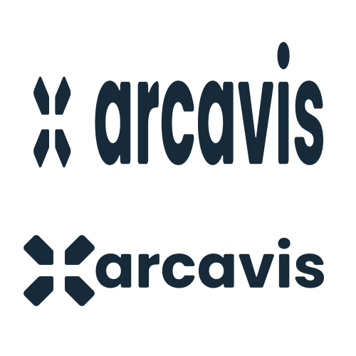
Our Logo is the heart of our corporate identity and the main way people recognize our brand visually, apart from Travis' face... 😉
It consists of 3 Elements 👇


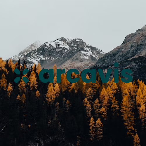
These Elements can be used separately based on context. They can be colored black, white or petrol. Combined, these components form the full logo 👇
Logo Tips
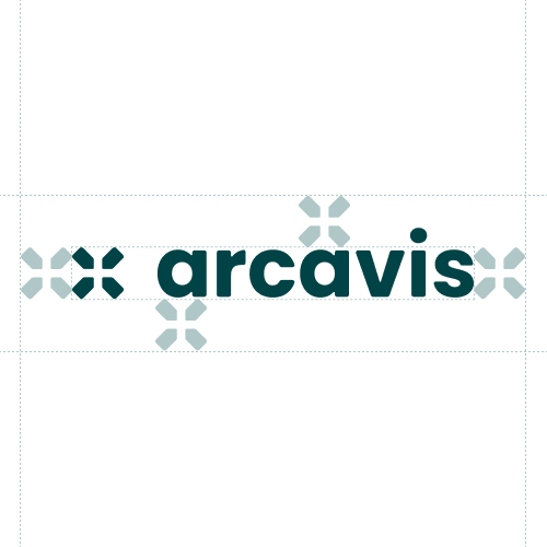
Do respect the minimum space of one icon per side around the logo
Don't use a logo variant with insufficient contrast
Don't use any other logo color variant than petrol, black and white
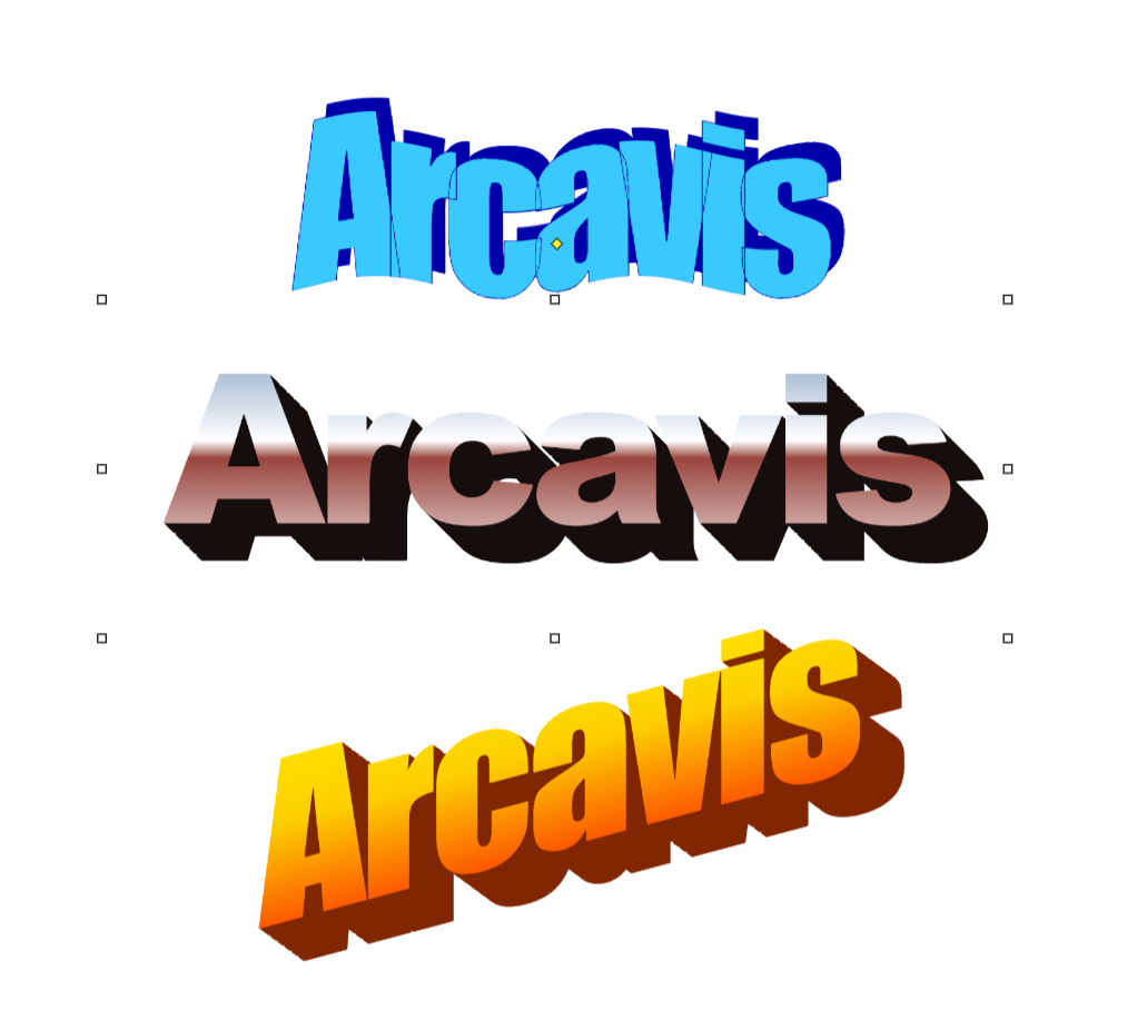
Don't use online-generated Wordart as our Logo
Don't change the Logo Proportions and Ratio
Colors
Color is used to increase our brand recognition even more and improve legibility of our designs. Always use color combinations that provide good contrast.
Secondary colors
In addition to our primary brand colors, which should be preferred, there are also secondary colors that can be used in things like charts, illustrations and animations.
Typography
We use Poppins wherever possible and Arial as a Fallback. We use the Light 300, Regular 400 and Bold 700 weights of the font.
Poppins is an Open Source font and can be found, downloaded and embedded directly via Google Fonts.
Icons
We use Material Icons for our icons, in the rounded style. If a specific icon isn't available, we will design it in a similar style. The currently defined icons can be found in this Figma file.
This is what these Icons look like 👇
Grid
As a layout foundation, we use a custom grid that is based on the look of barcodes. This allows for flexible and interesting compositions with a unique style.
By the way, in our User Interfaces, we use grids that are more practical. This grid is only for Marketing Materials, specifically our website and print media like pdfs.
User Interface Design
To have a unified look and user experience across Arcavis, here are a few basic principles.
Clear primary action
Create a clear hierarchy with primary and secondary actions.